
 |
A dialog box is a temporary, secondary window in which users perform a task that is supplemental to the task in the primary window. For example, a dialog box might enable users to set preferences or choose a file from the hard disk. A dialog box can contain panes and panels, text, graphics, controls (such as checkboxes, radio buttons, or sliders), and one or more command buttons. Dialog boxes use the native window frame of the platform on which they are running.
An alert box is a dialog box that provides for brief interaction with users. Alert boxes present error messages, warn of potentially harmful actions, obtain information from users, and display informational messages. The basic alert box has a symbol that identifies the type of the alert, a textual message, and one or more command buttons. The layout of these components is supplied by the Java look and feel.
Figure 73
Dialog Box and Alert Box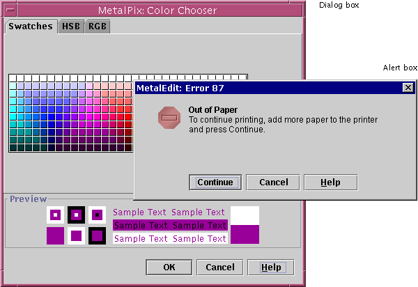
 If your application is based
on a multiple document interface (MDI), use the dialog boxes and alert boxes
presented in this chapter. Because these secondary windows use the platform's
native windows (and not the JFC-supplied internal frame), they are free to
move outside the desktop pane.
Dialog boxes can be modal or modeless. A modal dialog box prevents users from interacting with the application until the dialog box is dismissed. However, users can move a modal dialog box and interact with other applications while the modal dialog box is open. This behavior is sometimes called "application-modal."
A modeless dialog box does not prevent users from interacting with the application they are in or with any other application. Users can go back and forth between a modeless dialog box and other application windows.
 Use modeless dialog boxes
whenever possible. The order in which users perform tasks might vary, or users
might want to check information in other windows before dismissing the dialog
box. Users might also want to go back and forth between the dialog box and the
primary window.
 Use modal dialog boxes when
interaction with the application cannot proceed while the dialog box is
displayed. For example, a progress dialog box that appears while your
application is loading its data should be a modal dialog box.
The following figure illustrates dialog box design guidelines for the Java look and feel. The dialog box has a title in the window's title bar, a series of user interface elements, and a row of command buttons. The default command button is the OK button, indicated by its heavy border. The underlined letters are mnemonics, which remind users how to activate components by pressing the Alt key and the appropriate character key. The noneditable Ruler Units combo box has initial keyboard focus, indicating that the user's next keystrokes will take effect in that component.
 Use the form "Application
Name: Title" for the title of the dialog box (which is displayed in the title
bar).
 Include mnemonics for all
user interface elements except the default button and the Cancel button.
 When opening a dialog box,
provide initial keyboard focus to the component that you expect users to
operate first. This focus is especially important for users who must use a
keyboard to navigate your application (for example, users with visual and
mobility impairments).
 Consider the effect of
internationalization on your design. Use a layout manager, which allows for
text strings to become bigger or smaller when translated to another language.
For more information on internationalization, see Planning for Internationalization and Localization. For details on keyboard support for navigating through dialog boxes, see Table 17. For information on how to capitalize text in dialog boxes, see Capitalization of Text in the Interface.
The tab traversal order is the order in which the components in the dialog box receive keyboard focus on successive presses of the Tab key. If users press the Tab key when keyboard focus is on the last component in the dialog box, you should return keyboard focus to the first component. The following figure shows the tab traversal order that the designer has set for this preferences dialog box.
Figure 75 Tab
Traversal Order in the Sample Dialog Box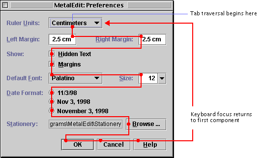
 Specify a logical tab
traversal order for the user interface elements. The traversal order should
match the reading order for your application's specified locale. For example,
in English, the traversal order is left to right, top to bottom. By default,
the traversal order is the sequence in which you added the components to the
dialog box.
 The
setNextFocusableComponent method from JComponent can be
used to specify the next component to receive keyboard focus.
The following figure shows the spacing you must provide between the borders of the dialog box and the components in the dialog box.
Figure 76
Spacing Between the Border and Components of a Dialog Box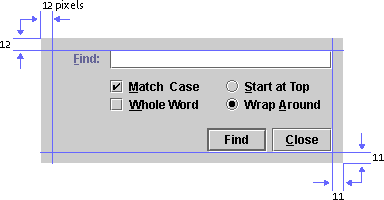
 Include 12 pixels between
the top and left borders of the dialog box and its components. Include 11
pixels between the bottom and right borders of the dialog box and its
components. (To the eye, the 11-pixel spacing appears to be 12 pixels because
the white borders on the lower and right edges of the components are not
visually significant.)
See Design Grids for a general description of how to place text and components in a dialog box.
Command Buttons in Dialog Boxes
In dialog boxes, you can place command buttons alone or in a command button row at the bottom of the dialog box, as shown in Figure 74. The most common command buttons that you might use in a command button row are the Help, Close, OK, Cancel, Apply, and Reset buttons. If you use other command buttons, make sure their labels describe the action they perform.
 Place command buttons that
apply to the dialog box as a whole in the command button row at the bottom of
the dialog box. This includes all buttons that dismiss the dialog box as one
of their actions.
 Align buttons in the command
button row along the lower-right edge of the dialog box. (The alignment of the
command button row in JFC-supplied alert boxes is different from the alignment
in dialog boxes.)
For consistency in the look and spacing of command buttons, follow the guidelines on Command Buttons. For keyboard operations appropriate to command buttons, see Table 15.
You can use a Help button in any dialog box. A Help button enables users to obtain additional information about the dialog box. For example, when users click Help in the Error alert box on page 125, the application opens a window with additional information on the cause of the error.
 When users click the Help
button, open a secondary or utility window that displays the help information.
 Place the Help button last
in a group of command buttons. For languages that read from left to right, the
Help button should be the rightmost button.
Close
Buttons
The Close button is commonly used to dismiss simple dialog boxes, such as an Info alert box. The Close button is also commonly used to dismiss dialog boxes in which user actions take effect immediately. In these dialog boxes, users do not need to press an OK button for the settings to take effect. A Close button is appropriate in both modal and modeless dialog boxes.
The following dialog box, which contains a schedule reminder, includes a Close button that users can click to dismiss the dialog box.
Figure 77
Dialog Box With a Close Button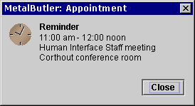
 When users click the Close
button, dismiss the dialog box and do not make additional changes to the
system.
OK and
Cancel Buttons
The OK and Cancel buttons work well in dialog boxes in which users specify options or settings. OK enables users to save the settings, whereas Cancel enables users to ignore any changed settings. In most cases, OK is the default button. OK and Cancel are appropriate in both modal and modeless dialog boxes. The following figure shows a preferences dialog box with OK, Cancel, and Help buttons.
Figure 78
Dialog Box With OK, Cancel, and Help Buttons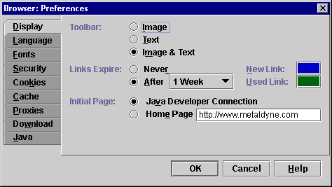
 When users click the OK
button, save the settings or carry out the commands specified in the dialog
box and close the dialog box. Whenever possible, use a command name that
describes the action (such as Print or Find) instead of OK.
 When users click the Cancel
button, close the dialog box and restore the settings in the dialog box to the
state they were in when the dialog box was opened.
 Activate the Cancel button
when users press the Escape key. The Cancel button does not need keyboard
focus for this interaction; only the dialog box must have focus. The Cancel
button and its keyboard equivalent are not built into the JFC; you must
implement them yourself.
 Do not add a mnemonic to the
Cancel button.
 Do not use the Cancel button
in a dialog box where settings become persistent before the dialog box is
closed (for example, in a dialog box that has an Apply button). Users might be
confused about whether the changes will be undone when they press Cancel. In
dialog boxes where you want users to be able to view changes without
committing to them, use Preview, OK, and Cancel buttons. Use Preview to show
the effects of the changes in the document window without dismissing the
dialog box. Use OK to make the changes persistent, and use Cancel to undo the
changes. OK and Cancel should dismiss the dialog box as usual.
Apply and
Reset Buttons
The Apply and Reset buttons work well in dialog boxes that remain open for repeated use, as shown in the properties dialog box in the following figure. Apply and Reset often appear together in modeless dialog boxes.
Figure 79
Dialog Box With Apply, Reset, and Close Buttons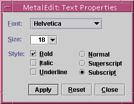
 Use the Apply button to
carry out the changes users specify in the dialog box without closing the
dialog box.
 Use the Reset button to
restore the values in the dialog box to the values specified by the last Apply
command. If users have not activated Apply, restore the values in effect when
the dialog box was opened. Do not close the dialog box when users choose
Reset.
 If you include the Close
button in a dialog box with Apply and Reset buttons, make Close dismiss the
dialog box without applying changes.
The default command button is the button that the application activates when users press Enter or Return. The JFC gives the default command button a heavier border than other command buttons. In most cases, you should assign the default button the action that users are most likely to perform, as shown with the OK button in the following figure. The default button does not need to have keyboard focus when users press Enter or Return.
Figure 80
Dialog Box With a Default Command Button
In cases where keyboard focus is on a component that accepts the Enter or Return key, such as a multiline text area, the default button is not activated when users press the key. Instead, the insertion point moves to the beginning of a new line. To operate the default button, users must move focus to a component that does not accept Enter or Return.
 If the dialog box has a
default button, make it the first command button in the group. For example, in
languages that read from left to right, the default button is the leftmost
button.
 Do not add a mnemonic for
the default command button.
You are not required to have a default command button in every dialog box and alert box. A command that might cause users to lose data should never be the default button, even if it is the action that users are most likely to perform. The following alert box asks users if they want to replace an existing file. The alert box has Replace and Cancel buttons, neither of which is the default command button.
Figure 81
Alert Box Without a Default Button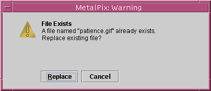
The find, login, preferences, print, and progress dialog boxes are common in many applications. These dialog boxes are not supplied by the Java Foundation Classes. The following sections show simple versions of these dialog boxes that are consistent with the Java look and feel. You can adapt the designs for these dialog boxes to suit your needs.
A find dialog box enables users to search for a specified text string. In most cases, you should make this dialog box modeless. An example is shown in the following figure.
Figure 82
Sample Find Dialog Box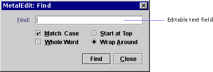
A login dialog box (shown in the following figure) enables users to identify themselves and enter a password. Depending on where you use this dialog box in your application, you can make it modal or modeless.
Figure 83
Sample Login Dialog Box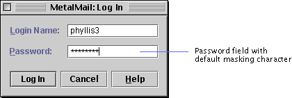
A preferences dialog box (shown in the following figure) enables users to view and modify the characteristics of an application. In most cases, you should make this dialog box modeless.
Figure 84
Sample Preferences Dialog Box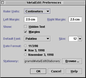
If your preferences dialog box is very complex, you can simplify it by using a tabbed pane to organize the options, as shown in Figure 78.
A print dialog box enables users to print and to specify print settings (such as the number of copies).
 Use the print dialog box
available from the AWT. On Microsoft Windows and Macintosh platforms, the AWT
uses the native print dialog box. For other environments, the AWT uses the
print dialog box supplied with the JDK.
A progress dialog box provides feedback for long operations and lets users know that the system is working on the previous command. The following progress dialog box monitors the progress of a file copy operation. The dialog box includes the JFC progress bar, a command button that users can click to stop the process, and labels to further explain the progress of the operation. In most cases, you should make a progress dialog box modeless.
Figure 85
Sample Progress Dialog Box
 Display a progress dialog
box (or supply a progress bar elsewhere in your application) if an operation
takes longer than two seconds.
 If you include a button to
stop the process, place it after the progress bar. (In languages that read
from left to right, the button appears to the right of the progress bar.) If
the state will remain as it was before the process started, use a Cancel
button. If the process might alter the state as it progresses (for example,
deleted records will not be restored), use a Stop button. If stopping the
process could lead to data loss, give users a chance to confirm the Stop
command by displaying a Warning alert box.
 Close the progress dialog
box automatically when the operation is complete.
 If delays are a common
occurrence in your application (for example, in a web browser), build a
progress bar into the primary window so that you don't have to keep displaying
a progress dialog box.
 Because translation of the
word "Stop" can result in words with subtly different meanings, point out to
your translators the specialized meaning of the Stop button in a progress
dialog box. Stop indicates that the process might leave the system in an
altered state.
An alert box, which conveys a message or warning to users, provides an easy way for you to create a dialog box. The JFC provides four types of alert boxes: Info, Warning, Error, and Question. Each alert box is provided with a symbol that indicates its type. You provide the title, the message, and the command buttons and their labels.
The layout of an alert box is provided in the JFC, so you don't have to worry about the spacing and alignment of the message, symbol, and command buttons. If you provide additional components, such as a text field, follow the layout guidelines for that component. You can make an alert box modal or modeless.
Figure 86
Standard Components in an Alert Box
 In an alert box, begin your
message with a brief heading in boldface. Start the body of the message on a
separate line.
 In the message for an alert
box, the <B>...</B> tags can be used to render a
heading in boldface. The <BR> tag can be used to create a
line break between the heading and the message body.
 An alert box is created
using the JOptionPane component.
An Info alert box presents general information to users. The symbol in the Info alert box is a blue circle with the letter i. The following Info alert box from an encyclopedia application provides information about a sponge.
 Provide a Close button to
dismiss the Info alert box. Provide additional command buttons, such as a Help
button, if needed.
A Warning alert box warns users about the possible consequences of an action and asks users for a response. The symbol in the Warning alert box is a yellow triangle with an exclamation point. The following alert box warns users that a file save operation will replace an existing file.
 Keep the message in the
Warning alert box brief, and use terms that are familiar to users.
 Include at least two buttons
in a Warning alert box: one button to perform the action and the other to
cancel the action. Provide the command buttons with labels that describe the
action they perform.
 If appropriate, provide a
Help button that opens a secondary or utility window that gives background
information about the warning. Do not close the alert box when users click the
Help button.
 Do not make a command button
whose action might cause loss of data the default button. Users might press
the Enter or Return key without reading the message. In such a case, you might
not provide a default button.
An Error alert box reports system and application errors to users. The symbol in the Error alert box is a red octagon with a rectangle. The following Error alert box reports that a printer is out of paper and provides users with three options. Clicking the Continue button resumes printing and dismisses the alert box. Clicking the Cancel button terminates the print job and dismisses the alert box. Clicking the Help button opens a secondary window that gives background information about the error.
 Include an error number in
the title bar of an Error alert box. The error number is helpful for users in
obtaining technical assistance, especially if the error message is localized
in a language not spoken by the technical support personnel.
 In the message of an Error
alert box, explain what happened, the cause of the problem, and what the user
can do about it. Keep the message brief and use terms that are familiar to
users.
 If appropriate, provide a
Help button to open a separate online help window that gives background
information about the error. Do not close the alert box when users click the
Help button.
 If possible, provide buttons
or other controls to resolve the error noted in the Error alert box. Label the
buttons according to the action they perform. If users cannot resolve the
error from the alert box, provide a Close button.
A Question alert box requests information from users. You can add components to this alert box (for example, a text field, list, or combo box) in which users can type a value or make a selection. The layout of the standard components (the symbol, message, and command buttons) is provided by the JFC. If you add components, follow the layout guidelines for that component. The symbol in the Question alert box is a green rectangle with a question mark.
The following Question alert box includes a label and text field in addition to the standard components.
 When you add components to a
Question alert box, align them with the leading edge of the message. For
languages that read from left to right, the leading edge is the left edge.
A color chooser provides one or more content panes from which users can select colors and a preview panel from which users can view the selected colors in context. You can display a color chooser in a dialog box, as shown in the following figure. The three command buttons (OK, Cancel, and Help) are part of the dialog box, not the color chooser.
Figure 91
Standard Color Chooser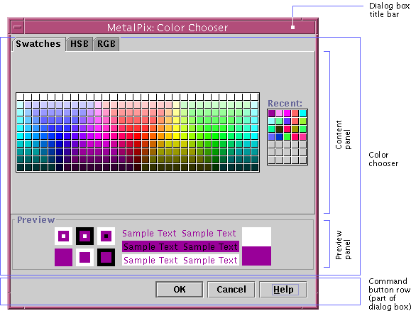
As supplied by the JFC, the color chooser offers users three methods for selecting a color:
If your application requires a different method for choosing colors, you can add a content pane with that feature. You can also remove existing content panes. If you use only one content pane, the tab disappears. In addition, you can specify your own preview panel.
 The color chooser is a
panel. The color panel can be inserted in a dialog box by using the
JDialog container.
| java.sun.com : |
Previous | Next | Contents | Index | Search |
Copyright 1999 Sun Microsystems, Inc. All Rights Reserved.