
 |
Primary windows, secondary windows, utility windows, and plain windows provide the top-level containers for your application. A primary window is a window in which users' main interaction with the data or document takes place. An application can use any number of primary windows, which can be opened, closed, minimized, or resized independently. A secondary window is a supportive window that is dependent on a primary window (or another secondary window). In the secondary window, users can view and provide additional information about actions or objects in a primary window. A utility window is a window whose contents affect an active primary window. Unlike secondary windows, utility windows remain open when primary windows are closed or minimized. An example of a utility window is a tool palette that is used to select a graphic tool. A plain window is a window with no title bar or window controls, typically used for splash screens.
Figure 53
Primary, Utility, Plain, and Secondary Windows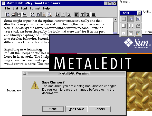
Similarly, as a designer you can use panels, panes, and internal frames as lower-level containers within primary and secondary windows. A panel is a container for organizing the contents of a window, dialog box, or applet. (You can place panels in panes or panes in panels.) A pane is a collective term for scroll panes, split panes, and tabbed panes, which are described in this chapter. An internal frame is a container used in MDI applications to create windows that users cannot drag outside of the desktop pane.
Figure 54
Scroll Pane, Tabbed Pane, Split Pane, and Internal Frame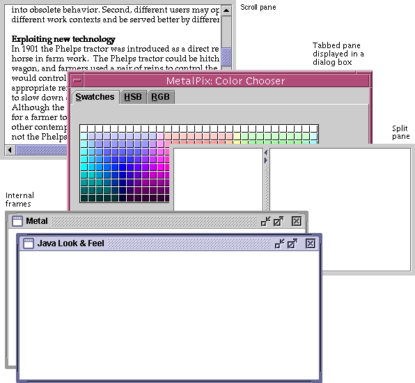
Primary windows act as top-level containers for the user interface elements that appear inside them. A primary window might hold a series of embedded containers. For example, a primary window in your application could have this organization, as shown in the following figure:
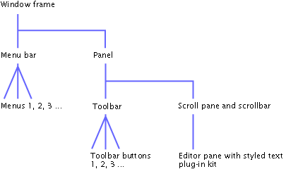
Note the appearance of the embedded containers in an actual primary window and their relationship to the underlying structure, as shown in the following figure:
Figure 56
Anatomy of a Primary Window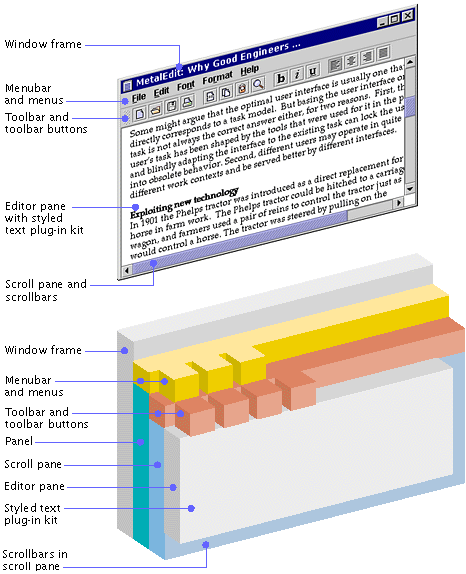
Primary windows, secondary windows, utility windows, and plain windows serve as the top-level containers for all the interface elements of your application.
Figure 57
Top-Level Containers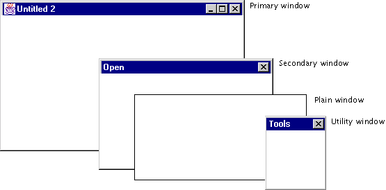
 Primary windows are
implemented using the JFrame component. Secondary windows and
utility windows are implemented using the JDialog component. Plain
windows are implemented using the JWindow component.
JFC applications display information such as documents inside primary windows. Such windows are provided by the native operating system of the platform on which the application is running--for instance, UNIX, Microsoft Windows, OS/2, or Macintosh.
Specifically, you cannot alter the appearance of the window border and title bar, including the window controls, which are provided by the native operating system. Window behavior, such as resizing, dragging, minimizing, positioning, and layering, is controlled by the native operating system.
The content provided by your application, however, assumes the Java look and feel, as shown in the following illustration of a MetalEdit document window as it appears on the Microsoft Windows platform.
Figure 58
Primary Window on the Microsoft Windows Platform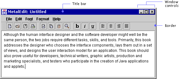
Typically, when users close or minimize a window, the operating system closes any associated secondary windows as well. However, the operating system does not take care of this behavior automatically for JFC applications.
 Keep track of the secondary
windows in your application; close them if the primary window is closed or
hide them if their primary window is minimized.
 Although
native operating systems display a close control on the title bar of typical
windows, provide a Close item or Exit item in your File menu as well.
 In the JFC, primary windows
are created using the JFrame component. This component appears with
the border, title bar, and window controls of the platform on which it is
running. This is the JFC component you are most likely to use as the top-level
container for a primary window.
Secondary windows, such as dialog boxes and alert boxes, are displayed in a window supplied by the native operating system. In the JFC, this component is called JDialog. It appears with the border and title bar of the platform on which it is running. Chapter 8 provides more guidelines for the design of dialog boxes and alert boxes. The following figure shows a JFC-supplied Warning alert box for the sample text-editing application, MetalEdit.
Figure 59
Alert Box on the Macintosh Platform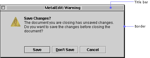
Dialog and alert box behavior, such as dragging and closing, is controlled by the native operating system. For keyboard operations that are appropriate to dialog and alert boxes, see Table 17.
 Keep in mind that some
platforms do not provide close controls in the title bar for dialog boxes.
Always provide a way to close the window in the dialog box or alert box
itself.
 The JOptionPane
component is used to implement an alert box. If the box supplied by the JFC
does not suit your needs, you can use the JDialog component.
You can create a window that is a blank plain rectangle. The window contains no title bar or window controls, as shown in the following figure. (Note that the black border shown around this plain window is not provided by the JFC.)
Figure 60
Plain Window Used as the Basis for a Splash Screen
A plain window does not provide dragging, closing, minimizing, or maximizing. You can use a plain window as the container for a splash screen, which appears and disappears without user interaction, as shown in the preceding figure.
 The JWindow
component is used to implement plain windows. The JFrame component
is used to implement primary windows.
In a non-MDI application with the Java look and feel, a utility window is often used to display a collection of tools, colors, or patterns. Unlike the palette windows provided for MDI applications, utility windows do not float above all the other windows. The following figure shows a utility window that displays a collection of tools.
Unlike secondary windows, which should be closed automatically when their associated windows are closed, utility windows should not be closed when primary windows are closed.
User choices made in a utility window refer to and affect the active primary window. A utility window remains on screen for an extended period of time while users go back and forth between the utility window and primary windows. In contrast, a secondary window is designed to enable users to resolve an issue in an associated primary window and is usually dismissed once users have resolved the issue.
For information on keyboard operations appropriate for utility windows, see Table 17.
 Since utility windows are
not dependent on a primary window, do not automatically dismiss utility
windows when primary windows are closed.
 Utility windows in your
application are implemented using the JDialog component. Palettes
to be used within MDI applications are implemented as a form of the
JInternalFrame component.
The JFC provides a number of user interface elements you can use for the organization of windows: panels, tabbed panes, split panes, and scroll panes. Panels and panes can be used to organize windows into one or more viewing areas. A panel is a JFC component that you can use for grouping other components inside windows or other panels. A pane is a collective term for scroll panes, split panes, and tabbed panes.
Figure 62
Lower-Level Containers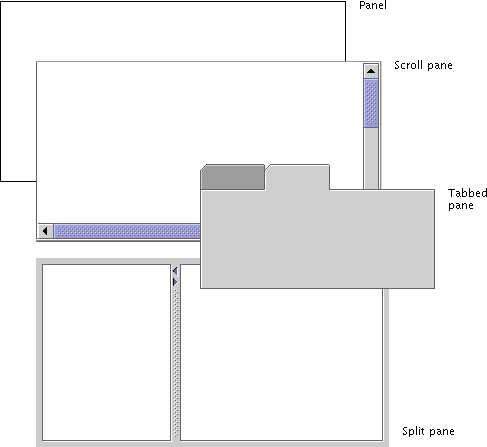
In contrast to scroll panes and tabbed panes, which typically play an interactive role in an application, a panel simply groups components within a window or another panel. Layout managers enable you to position components visually within a panel. For a thorough treatment of the visual layout and alignment of components, see Layout and Visual Alignment. For more information on layout managers, see The Java Tutorial at http://java.sun.com/docs/books/tutorial.
A scroll pane is a specialized container offering vertical and horizontal scrollbars that enable users to change the visible portion of the window contents.
Here is an example of a scroll pane with a vertical scrollbar. The size of the scroll box indicates the proportion of the content currently displayed.
Figure 63
Scroll Pane in a Document Window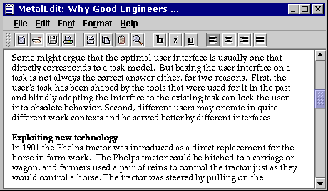
You can choose whether scrollbars are always displayed in the scroll pane or whether they appear only when needed.
 Unless otherwise indicated,
use the default setting for horizontal scrollbars, which specifies that they
appear only when needed.
 If the data in a list is
known and appears to fit in the available space (for example, a predetermined
set of colors), specify that a vertical scrollbar should appear only if
needed. For instance, if users change the font, the list items might become
too large to fit in the available space, and a vertical scrollbar would be
required.
 If the data in a scroll pane
sometimes requires a vertical scrollbar, specify that the vertical scrollbar
always be present. Otherwise, the data must be reformatted whenever the
vertical scrollbar appears or disappears.
 Scrollbars are obtained by
placing the component, such as a text area, inside a scroll pane.
Scrollbars
A scrollbar is a component that enables users to control what portion of a document or list (or similar information) is visible on screen. In locales with left-to-right writing systems, scrollbars appear along the bottom and the right sides of a scroll pane, a list, a combo box, a text area, or an editor pane. In locales with right-to-left writing systems, such as Hebrew and Arabic, scrollbars appear along the bottom and left sides of the relevant component. By default, scrollbars appear only when needed to view information that is not currently visible, although you can specify that the scrollbar is always present.
The size of the scroll box represents the proportion of the window content that is currently visible. The position of the scroll box within the scrollbar represents the position of the visible material within the document. As users move the scroll box, the view of the document changes accordingly. If the entire document is visible, the scroll box fills the entire channel.
Both horizontal and vertical scroll boxes have a minimum size of 16 x 16 pixels so that users can still manipulate them when viewing very long documents or lists.
At either end of the scrollbar is a scroll arrow, which is used for controlling small movements of the data.
The following figure shows horizontal and vertical scrollbars. Each scrollbar is a rectangle consisting of a textured scroll box, a recessed channel, and scroll arrows.
Figure 64
Vertical and Horizontal Scrollbars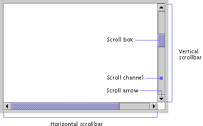
Do not confuse the scrollbar with a slider, which is used to select a value. For details on sliders, see here.
Users drag the scroll box, click the scroll arrows, or click in the channel to change the contents of the viewing area. When users click a scroll arrow, more of the document or list scrolls into view. The contents of the pane or list move in increments based on the type of data. When users hold down the mouse button, the pane or list scrolls continuously.
For a description of keyboard operations for scrollbars, see Table 22.
 Scroll the content
approximately one view at a time when users click in the scrollbar's channel.
For instance, in a document, a view might represent a page of text. Leave one
small unit of overlap from the previous view to provide context for the user.
For instance, in scrolling through a long document, help users become oriented
to the new page by providing one line of text from the previous page.
 Scroll the content one small
unit at a time when users click a scroll arrow. (A small unit might be one
line of text, one row in a table, or 10 to 20 pixels of a graphic.)
 Display a horizontal
scrollbar if the view cannot show everything that is important--for instance,
in a word-processing application that prepares printed pages, users might want
to look at the margins as well as the text.
 If you are using the Java 2
SDK, place scrollbars in the orientation that is suitable for the writing
system of your target locale. For example, in the U.S. locale, the scrollbars
appear along the right side of the scroll pane or other component. In other
locales, they might appear along the left side of the scroll pane.
A tabbed pane is a container that enables users to switch between several content panes (usually JPanel components) that appear to share the same space on screen.
The tabs themselves can contain text or images or both. A typical tabbed pane appears with tabs displayed at the top. Alternatively, the tabs can be displayed on one of the other three sides. If the tabs cannot fit in a single row, additional rows are created automatically. Note that tabs do not change position when they are selected. For the first row of tabs, there is no separator line between the selected tab and the pane.
The following figure shows the initial content pane in the JFC-supplied color chooser. Note that the tabbed pane is displayed within a dialog box that uses the borders, title bar, and window controls of the platform on which its associated application is running.
Figure 65
Swatches Content Pane in the JFC Color Chooser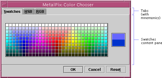
Users choose which content pane to view by clicking the corresponding tab. The content pane changes accordingly, as shown in the following figure of the content pane associated with the third tab in the color chooser.
For a list of keyboard operations appropriate for tabbed panes, see Table 25.
Figure 66 RGB
Content Pane in the JFC Color Chooser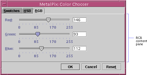
You can use tabbed panes to good advantage in dialog boxes, such as a preferences dialog box, that require you to fit a lot of information into a small area.
You can also use tabbed panes to provide a way for users to switch between content panes that represent:
 Use headline capitalization
for tab names.
 Provide mnemonics so users
can navigate from tab to tab and from tabs to associated content panes using
keyboard operations.
 If your tabbed pane requires
multiple rows of tabs, consider dividing the content among several dialog
boxes or components. Multiple rows of tabs can be confusing.
A split pane is a container that divides a pane into resizable panes. Split panes enable users to adjust the relative sizes of two adjacent panes. The Java look and feel drag texture (along with a pointer change) indicates that users can resize split panes.
To adjust the size of the split panes, users drag the splitter bar, as shown in the following figure.
Figure 67
Split Pane (Horizontal Orientation)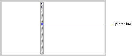
Users can also control the splitter bar by clicking one of the optional zoom buttons shown in the following figure. Clicking a button moves the splitter bar to its extreme upper or lower position. If the splitter bar is already at its extreme, clicking restores the panes to the size they were before the zoom operation (or before the user dragged the splitter bar to close one of the panes).
For a list of keyboard operations appropriate for split panes, see Table 24.
Figure 68 Zoom
Buttons in a Split Pane (Vertical Orientation)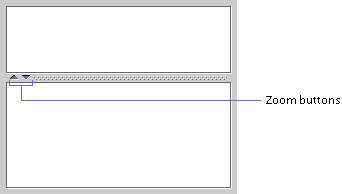
 Include zoom buttons in
split panes because they are very convenient for users.
Nested
Split Panes
In addition to splitting panes either horizontally or vertically, you can nest one split pane inside another. The following figure portrays a mail application in which the top pane of a vertically split pane has another split pane embedded in it.
A multiple document interface (MDI) provides a way to manage multiple windows that are confined inside a main window. A limitation to using the MDI application model is that users cannot drag the application's windows outside the main window. To support MDI designers, the JFC provides the internal frame and palette window.
 If you are working with an
MDI using the Java look and feel, the JDialog component can be used
to create secondary windows.
To get standard window features in an MDI, you must put an internal frame inside the desktop pane. A desktop pane is a component placed inside a window that holds internal frames for an MDI application.
The internal frame is a container used in MDI applications to create windows that users cannot drag outside of the desktop pane. In an MDI application that uses the Java look and feel, internal frames have a window border, title bar, and standard window controls with the Java look and feel. However, the window that contains the desktop pane is a native platform window with the native look and feel, as shown in the following figure.
Figure 70
Internal Frames in an MDI Application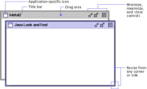
For keyboard operations appropriate to internal frames, see Table 16.
A minimized internal frame is a horizontally oriented component (shown in the following figure) that represents an internal frame that has been minimized. The width of these minimized internal frames is sized to accommodate the window title. Minimized internal frames consist of a drag area followed by an area containing an application-specific icon and text, which displays the name of the internal frame.
Figure 71
Minimized Internal Frame
Users can rearrange minimized internal frames by dragging the textured area. Users can click the icon and text area in a minimized internal frame to restore the frame to its previous location and size.
For details on the keyboard operations appropriate for minimized internal frames, see Table 16.
A palette window is a type of internal frame that can float above other internal frames within the desktop pane for an MDI application. The close control is optional.
The following figure shows a palette window from a hypothetical graphical interface builder with a set of buttons that lets users construct menus.
Palette windows often contain toggle buttons; users can click the toggle buttons to select them. However, palette windows can contain any component. Users can close palette windows (if you provide a close control), but they cannot resize, minimize, or maximize them.
For keyboard operations for palette windows, see Table 16.
 If you are writing a non-MDI
application, use utility windows instead of palette windows so that the user
can drag them anywhere on the screen.
 A palette window is a
specific style of JInternalFrame and, therefore, can be used only
within a desktop pane. Use the client properties mechanism to set the
JInternalFrame.isPalette to true.
| java.sun.com : |
Previous | Next | Contents | Index | Search |
Copyright 1999 Sun Microsystems, Inc. All Rights Reserved.