
 |
A menu displays a list of choices (menu items) for users to choose or browse through. Typically, menus are logically grouped and displayed by an application so that a user need not memorize all available commands or options. Menus in the Java look and feel are "sticky"--that is, they remain posted on screen after users click the menu title. Usually the primary means to access your application's features, menus also provide a quick way for users to see what those features are.
A toolbar is a collection of frequently used commands or options that appear as a row of toolbar buttons. Toolbars normally appear horizontally beneath a primary window's menu bar, but they can be dragged anywhere in the window or into a separate window. Toolbars typically contain buttons, but you can provide other components (such as text fields and combo boxes) as well.
In Java look and feel applications, you can provide three kinds of menus: drop-down menus, submenus, and contextual menus. A drop-down menu is a menu whose titles appear in the menu bar. A submenu appears adjacent to a menu item in a drop-down menu; its presence is indicated by an arrow next to the item. A contextual menu displays lists of commands, settings, or attributes that apply to the item or selected items under the pointer.
Figure 92
Drop-down Menu, Submenu, Contextual Menu, and Toolbar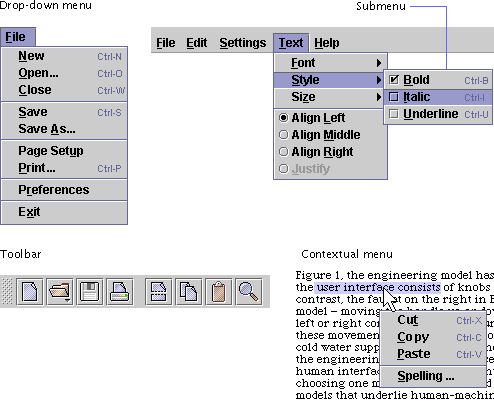
In the Java look and feel, menus use a highlight color (primary 2) for the background of selected menu titles and menu items. The following figure shows an example of a drop-down menu that is selected and displayed. Within the Text menu, the Style item is selected; a submenu appears that includes the Bold, Italic, and Underline checkbox menu items. (The Italic checkbox menu item is highlighted.)
A separator divides the menu items for specifying font, style, and size from the alignment radio button items. Keyboard shortcuts appear to the right of the frequently used menu items, and mnemonics are included for each menu title and menu item.
The menu bar appears at the top of a primary window and contains menu titles, which describe the content of each menu. Menu titles usually appear as text; however, it is possible to use a graphic or a graphic with text as a menu title. Menu titles in the Java look and feel contain mnemonics only if they are explicitly set by the developer. See Mnemonics for details.
A drop-down menu appears when users choose a menu title in the menu bar.
 If the primary window has a
menu bar, display it as a single line across the top of the window.
 Do not display menu bars in
secondary windows unless you have a compelling reason to do so (such as a
complex set of activities in the secondary window).
 Be sure to include mnemonics
for every menu title in your menu bar.
 If your applet runs in the
user's current browser window (with the browser menu bar), do not display your
own menu bar in the applet. Although applets displayed inside a browser window
can theoretically have their own menu bars, users are often confused when both
the browser window and the applet have menu bars. If your applet requires a
menu bar, display the applet in a separate browser window without its own menu
bar or navigation controls.
 Even on Macintosh systems,
which ordinarily place a menu bar only at the top of the screen, display menu
bars in windows for a Java look and feel application. On the Macintosh, the
screen-top menu bar remains, but, since all the application menus are in the
windows, the only command in the screen-top menu bar should be Quit in the
File menu.
The menu bar contains all of the drop-down menus and submenus in your application. Each menu in the menu bar is represented by its menu title. The titles describe the content of each menu. (The title for a submenu is its menu item in the drop-down menu.)
Users can display menus in two ways:
For details on keyboard navigation, selection, and activation in menus, see Table 20.
 Use single words for your
menu titles.
 Use menu titles that help
users guess which menu contains the item of particular interest at a given
moment. For example, the Edit menu typically contains commands that enable
users to change or edit the contents of their documents or data.
 Include mnemonics in all
your menu titles.
A submenu is a menu that users open by highlighting a menu item in a higher-level menu. Sometimes you can shorten a menu by moving related choices to a submenu. Submenus (such as the Style submenu shown in the following figure) appear adjacent to the submenu indicator. For instance, the Style item opens a submenu consisting of three items: Bold, Italic, and Underline. Note that the items in the Style submenu include both keyboard shortcuts and mnemonics.
Users display submenus by clicking or by dragging over the corresponding menu item. The first item in the submenu aligns with the submenu indicator, slightly overlapping the main menu. Just as in other menus, items in the submenu are highlighted when the user moves the pointer over them.
For a list of keyboard operations in submenus, see Table 20.
Figure 94 Menu
Item With Its Submenu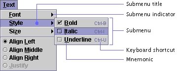
 Since many people find
submenus difficult to use, avoid the use of a second level of submenus. If you
want to present a large or complex set of choices, display them in a dialog
box.
 Submenus are created using
the JMenu component.
A simple menu item consists of the command name, such as Undo. When a menu item is available for use, its text is displayed in black, as shown in the following figure.
When users position the pointer over an individual item within a menu, the menu item (if available) is highlighted.
Users can choose menu items in two ways:
For a list of keyboard operations for menu items, see Table 20.
Available and Unavailable Items
Here are some guidelines for handling available and unavailable menu items in your application.
 If an application feature is
not currently available in a window, but users can do something to make it
available, make the corresponding menu item unavailable and dim its text. For
example, the Undo command might not be available until the user has made a
change in a document window.
 If all the items in a menu
are unavailable, do not make the menu unavailable. In this way, users can
still display the menu and view all its (inactive) items. Similarly, if all
the items in a submenu are currently not available, do not make the original
menu item unavailable.
 If there is nothing users
can do to make a menu item available, omit the item entirely rather than just
making it unavailable. Making an item unavailable implies that users can do
something to make the item available. A similar rule applies to submenu items
and contextual menus.
Composition and Construction of Items
Here are some recommendations for the use of concise language, consistent capitalization, and keyboard operations in menu items.
 Make your menu items brief,
and confine them to a single line.
 Use headline capitalization
in menu titles and menu items.
 Include mnemonics for all
menu items.
 Offer keyboard shortcuts for
frequently used menu items.
 Use the same keyboard
shortcut if a menu item appears in several menus--for instance, if a Cut item
appears in a contextual menu as well as in a drop-down Edit menu, use Ctrl-X
for both.
Commonly used keyboard shortcuts are described in Typical File Menu, Typical Edit Menu, and Typical Help Menu.
Ellipses (...) are punctuation marks that indicate the omission of one or more words that must be supplied in order to make a construction complete. In your menus, you can use ellipses in a similar way: to indicate that the command issued by a menu item needs more specification in order to make it complete.
 If a menu item does not
fully specify a command and users need a dialog box to finish the
specification, use an ellipsis after the menu item. For example, after
choosing Save As..., users are presented with a file chooser to specify a file
name and location.
 Do not use an ellipsis mark
simply to indicate that a secondary or utility window will appear. For
example, choosing Preferences displays a dialog box; because that display is
the entire effect of the command, however, Preferences is not followed by an
ellipsis.
Organization of Items
You can group menu items with separators or, in the case of lengthy extensible menus, with a grid layout. Here are the guidelines:
 Use
separators to group similar menu items in a way that helps users find items
and better understand their range of choices. For instance, in a typical File
menu, the commands that affect saving are separated from those that are
relevant to printing.
 If a menu is or has the
potential to become very long (for instance, in menus that present lists of
bookmarks or email recipients), a grid layout should be used to display the
menu choices in multiple columns.
A checkbox menu item is a menu item that appears with a checkbox next to it to represent an on or off setting. A check mark in the adjacent checkbox graphic indicates that the value associated with that menu item is selected. A dimmed checkbox menu item shows a gray box (checked or unchecked) that indicates that the setting cannot be changed. The following figure shows checked, unchecked, and unavailable menu items.
You can use checkbox menu items to present users with a nonexclusive choice.
For a list of keyboard operations for checkbox menu items, see Table 20.
 For consistency, use the
standard checkbox graphic for checkbox menu items.
 As with all menu items,
after users choose a checkbox menu item, the menu is dismissed. To choose
another item, users must reopen the menu. Therefore, use checkbox menu items
with restraint. If users must set more than one or two related preferences,
place the checkboxes in a dialog box (or provide a palette or toolbar buttons
for the preferences).
A radio button menu item is a menu item that appears with a radio button next to it to represent an off or on setting. Each radio button menu item offers users a single choice within a set of radio button menu items, as illustrated in the following set of alignment options.
Figure 97
Radio Button Menu Items
For a list of keyboard operations for radio button menu items, see Table 20.
 To indicate that the radio
button items are part of a set, group them and use separators to distinguish
them from other menu items.
 As with all menu items,
after users choose a radio button menu item, the menu is dismissed. To choose
another item, users must reopen the menu. Therefore, use radio button menu
items with restraint. If users must set more than one or two related
preferences, place the radio buttons in a dialog box (or provide a palette or
toolbar buttons for the preferences).
A separator is a line graphic that is used to divide menu items into logical groupings, as shown in the following figure.
Figure 98
Separators in a Menu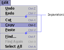
Users can never choose a separator.
You can use separators to make lengthy menus easier to read.
 While separators serve
important functions on menus, avoid using them elsewhere in your application.
Instead, use blank space or an occasional titled border to delineate areas in
dialog boxes or other components.
Several drop-down menus, such as File, Edit, and Help, occur in many applications. These menus are not supplied by the Java Foundation Classes. The following sections show simple versions of these menus that are consistent with the Java look and feel. You can adapt these menus to suit your needs.
 If your
application needs these commonly used menus, place the menu titles in this
order: File, Object, Edit, Format, View, and Help. If needed, insert other
menus between the View and Help menus.
The first menu displays commands that apply to an entire document or the application as a whole. Typically, this is called the File menu, but in some cases another title might be more appropriate. The following figure illustrates common File menu items in order, with mnemonics and keyboard shortcuts.
You can add or remove menu items as needed.
 Place commands that apply to
the document (or another object) or application as a whole in the File menu.
 If your application
manipulates objects that your users might not think of as "files," give the
first menu another name. Ensure that the name corresponds to the type of
object or procedure represented by the entire window in your application. For
example, a project management application could have Project as its first
menu, or a mail application could have a Mailbox menu.
 Since the Close item
dismisses the active window, close any dependent windows at the same time.
 If you provide an Exit item,
have it close all associated windows and terminate the application. (Be sure
to use the term Exit, not Quit.)
Object menu items provide actions that users can perform on an object or objects. An object might be almost anything--for instance, an icon representing a person for whom you want to add an email alias.
The Edit menu displays items that enable users to change or edit the contents of their documents or other data. These items give users typical text-editing features. The following figure shows common Edit menu items in order, with mnemonics and keyboard shortcuts.
 Place commands that modify
the contents of documents or other data in the Edit menu, including Undo,
Redo, Cut, Copy, Paste, and Find.
 The Swing Undo package can
be used to provide the Undo and Redo commands.
The Format menu displays items that enable users to change such formatting elements in their documents as font, size, styles, characters, and paragraphs. The following figure shows common Format menu items with their mnemonics.
Figure 101
Typical Format Menu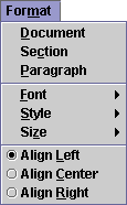
View menu items provide ways for users to adjust the view of data in the active window. For instance, the View menu in a network management application might have items that enable users to view large or small icons for network objects.
Help menu items provide access to online information about the features of an application. This menu also provides access to the application's About box, which displays basic information about the application. For details, see Designing About Boxes. The following figure shows common Help menu items (in the typical order) with their mnemonics.
These menu items will vary according to the needs of your application.
 In your Help menu, allow
access to online information about the features of the application.
 Place a separator before an
About Application item that displays a dialog box with the product name,
version number, company logo, product logo, legal notices, and names of
contributors to the product.
 JavaHelpTM, a
standard extension to the Java Development Kit and the Java 2 SDK, can be used
to build a help system for your applications.
Sometimes called a "pop-up menu," a contextual menu offers only menu items that are applicable or relevant to the object or region at the location of the pointer. The appearance of contextual menus in the Java look and feel is similar to that of drop-down menus, including the display of mnemonics and keyboard shortcuts. Contextual menus do not have a menu title. The following figure shows a contextual menu offering editing commands.
Users can display a contextual menu by clicking or pressing mouse button 2 while the pointer is over an object or area that is associated with that menu. (On the Macintosh platform, users click while holding down the Control key.)
For keyboard operations appropriate to contextual menus, see Table 20.
 Ensure that any features you
present in contextual menus are also available in more visible and accessible
places, like drop-down menus. Users might not know contextual menus are
available, especially if your application does not use this kind of menu
consistently throughout the application.
 Display keyboard shortcuts
and mnemonics in contextual menus that are consistent with their usage in
corresponding drop-down menus.
 Contextual menus are created
using the JPopupMenu component.
A toolbar provides quick and convenient access to a set of frequently used commands or options. Toolbars typically contain buttons, but other components (such as text fields and combo boxes) can be placed in the toolbar as well. An optional, textured "drag area" on the toolbar indicates that users can drag the toolbar anywhere in the window or into a separate window. The drag area is on the leading edge when the toolbar is horizontal and on the top when it is vertical.
The following figure shows a toolbar with a drag area on the leading edge. For another example, see Figure 8.
Users typically access the components in the toolbar by clicking. For information on the keyboard operations that are appropriate for toolbars, see Table 31.
 Include commonly used menu
items as buttons or components in your toolbar.
 Make special provisions for
toolbar accessibility if your window does not have menus. Such provisions
might include a text identifier, either as button text or in text below the
button. Be sure to provide a mnemonic for such text.
In general, a toolbar is located at the edge of the window or area on which it operates.
 If your window has a menu
bar, place the toolbar horizontally immediately under the menu bar.
 Limit your window to a
single toolbar with a single row of buttons or components. Multiple toolbar
rows create clutter and make the features harder to find.
You can specify that your toolbar be draggable. Users can then move it or display it in a separate window. Users drag the toolbar by holding the mouse button down over the drag area. An outline of the toolbar moves as the user moves the pointer. The outline provides an indication of where the toolbar will appear when the user releases the mouse button. When the pointer is over a "hot spot," the outline has a dark border, indicating the toolbar will anchor to an edge of the container, as shown in the following figure. The toolbar automatically changes its orientation between horizontal and vertical depending on the edge of the window where it anchors.
Figure 105
Outline of a Toolbar Being Dragged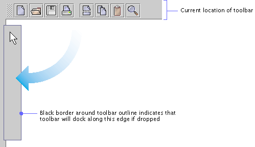
If the pointer is outside a hot spot, the outline has a light border, indicating that the toolbar will be displayed in a separate window. The following figure shows the toolbar in a separate window. When the user closes the window, the toolbar returns to its original location.
Figure 106
Toolbar in a Separate Window
 A toolbar can dock (attach)
along the top, bottom, left, or right edge of a container.
A toolbar button is a command button or toggle button that appears in a toolbar, typically as part of a set of such buttons. Toolbar buttons can also act as titles to display menus. In other contexts, command buttons typically use text to specify the operation or state they represent, but toolbar buttons typically use graphics.
Toolbar graphics can be difficult for users to understand. Weigh the comprehensibility of your graphics against the space taken up by button text before deciding whether to use button text in addition to the button graphics.
 Use button graphics that are
either 16 x 16 or 24 x 24 pixels (but not both in the same toolbar), depending
on the space available in your application.
 If you use text on the
toolbar buttons, provide a user setting to display only the graphics. Using
this mode, you can conserve space and display more commands and settings in
the toolbar.
 To facilitate keyboard
access, define a mnemonic for each toolbar button (or other component) that
has text.
Toolbar
Button Spacing and Padding
This section contains the vertical (padding) and horizontal (spacing) measurements for toolbar buttons in toolbars. The following figure shows the padding and spacing between individual toolbar buttons and groups of toolbar buttons.
 Space individual toolbar
buttons 2 pixels apart. Space groups of toolbar buttons 11 pixels apart.
 Include 3 pixels of padding
above and below toolbar buttons. This actually means 2 pixels of padding below
the toolbar because of the white border on the buttons.
Figure 107
Toolbar Button Spacing
 The inset on toolbar buttons
should be 0.
Mouse-over Borders
To conserve space, you can use mouse-over borders (also called "rollover borders") on toolbar buttons. This border appears around a button when users move the pointer over it; otherwise, the border is invisible.
The following figure shows a toolbar button with a mouse-over border activated for the Open button.
Figure 108
Mouse-over Border on a Toolbar Button
 When you use mouse-over
borders, space individual toolbar buttons zero pixels apart within a group.
 The
JToolBar.isRollover client property is set to true to enable
mouse-over borders.
Drop-down
Menus in Toolbar Buttons
You can attach a drop-down menu to a toolbar button. The menu appears when the user clicks (or presses and holds the mouse button over) the toolbar button. The following figure shows a drop-down menu indicated by a drop-down arrow on the Open button. The menu provides a list of files to open.
Figure 109
Toolbar Button With a Drop-down Menu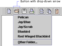
 Provide a drop-down arrow in
the graphic for any toolbar button that has a drop-down menu.
Tool Tips
for Toolbar Buttons
You can provide tool tips for the toolbar components. The tool tip displays information about the component when the user rests the pointer on it. If you specify a keyboard shortcut for a toolbar component, the JFC displays it in the tool tip. The following figure shows a tool tip that describes the Cut button.
Figure 110
Tool Tip for a Toolbar Button
 Keyboard shortcuts for
toolbar buttons should match the keyboard shortcuts for the corresponding menu
items.
 Attach tool tips to all
toolbar components that do not include text identifiers. Tool tips are
valuable for all toolbar components because they display keyboard shortcuts.
 If your application does not
have menus, attach tool tips to the toolbar buttons in order to display
keyboard shortcuts.
A tool tip provides information about a component or area when the user rests the pointer on it (and does not press a mouse button). These small rectangles of text can be used anywhere in your application. A tool tip is commonly associated with an interface element, where it provides a short description of the component's function. If a component has a keyboard shortcut, the shortcut is automatically displayed in the tool tip.
The following figure shows a tool tip that describes a slider.
Figure 111
Tool Tip for a Slider
You can also use tool tips with graphics. A graphic might have one tool tip that provides the name and size of the graphic or several tool tips that describe different areas of the graphic.
The following figure shows a tool tip on an area of the bar chart in the sample applet, Retirement Savings Calculator.
Figure 112
Tool Tip on an Area Within a Graphic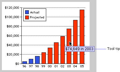
You can adjust the timing of the tool tips in your application. By default, a tool tip appears after the user rests the pointer on the component or area for 750 milliseconds. It disappears after four seconds or when the user activates the component or moves the pointer off the component.
For keyboard operations in tool tips, see Table 30.
 Make tool tips active by
default, but provide users a way to turn them off. For example, you might
provide a checkbox in either a menu or in a preferences dialog box.
 A tool tip is specified in
its associated component (and not by calling the JToolTip class
directly).
 All components need to have
an AccessibleName set. However, interactive components that provide
a descriptive tool tip don't need to have an AccessibleDescription
set.
For details on the Java 2 Accessibility API, see Support for Accessibility.
| java.sun.com : |
Previous | Next | Contents | Index | Search |
Copyright 1999 Sun Microsystems, Inc. All Rights Reserved.